- Color- Dance of Colors and Movement
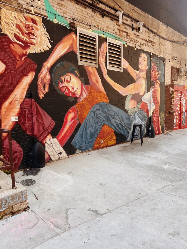
Color plays a huge role in design as it is the first thing most people notice when looking at a design element. In this mural, the vivid reds and oranges, as well as the skin tones, contrast sharply against the dark black background to make the figures stand out. The use of colors like this enhances the depth of the mural. These warm hues also contribute to the passion and emotion that align with the painting. Lastly, the variation in shading among the skin tones gives the figures a three-dimensional appearance, enhancing realism while maintaining the illustrative style. The mural effectively uses color not only to create contrast and emphasis but also to evoke emotion and movement, contributing to its overall dynamic composition.
2. Form/Function/Message – Bold Words, With Big Warnings
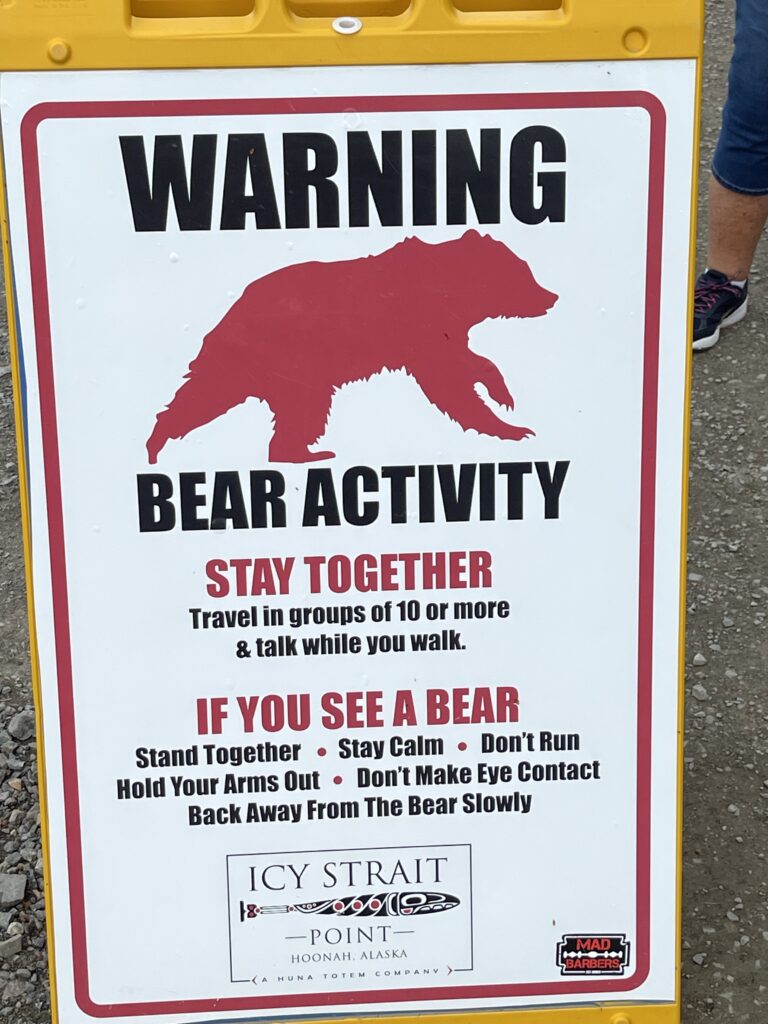
Form, function, and message are important design elements for conveying meaning to a large group of people. This poster is an example of these design principles. The bold red and black color scheme quickly captures attention, and the use of red conveys urgency. The silhouette of the bear is easily recognizable, ensuring clear visual communication. The use of uppercase typography enhances readability from a distance.
The function of this sign is also very clear. It effectively serves its purpose by warning visitors of bear activity and providing clear instructions—starting with a warning at the top, followed by preventive measures, and then emergency steps if encountered by a bear. Overall, this poster balances form, function, and message to create an effective and informative warning sign.
3. Typography – Bold statments
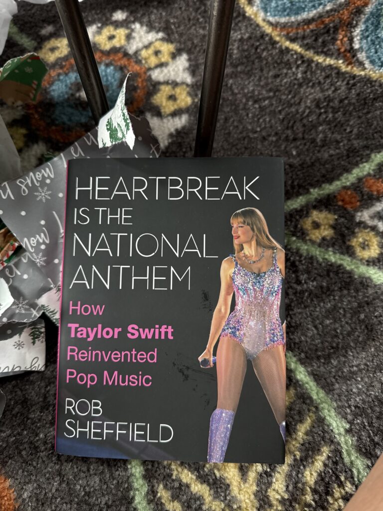
Typography is the visual component of written words and the use of different types of text and fonts to display various messages and emotions. This book cover effectively uses the design element of typography by having the title “Heartbreak is the National Anthem” in large, bold, all-uppercase white letters, which immediately draws the eye. This establishes the main theme of the book and creates a dramatic impact.
Right below that, the subtitle “How Taylor Swift Reinvented Pop Music” uses bold pink to highlight her name, making it the focal point, which again points to the book’s subject matter. The combination of the white and pink text against the black background also enhances readability and makes for a bold and modern look, with a pop of pink to add playful elements.
The font is very clean and contemporary, which aligns with the modern, pop-focused subject of the book. Using uppercase letters gives a bold and confident feel, mirroring Taylor Swift’s influential impact on the music industry. The use of typography in this book cover is carefully designed to be bold, modern, and engaging while complementing each element.
4. Unity – Lets Bring it all Together
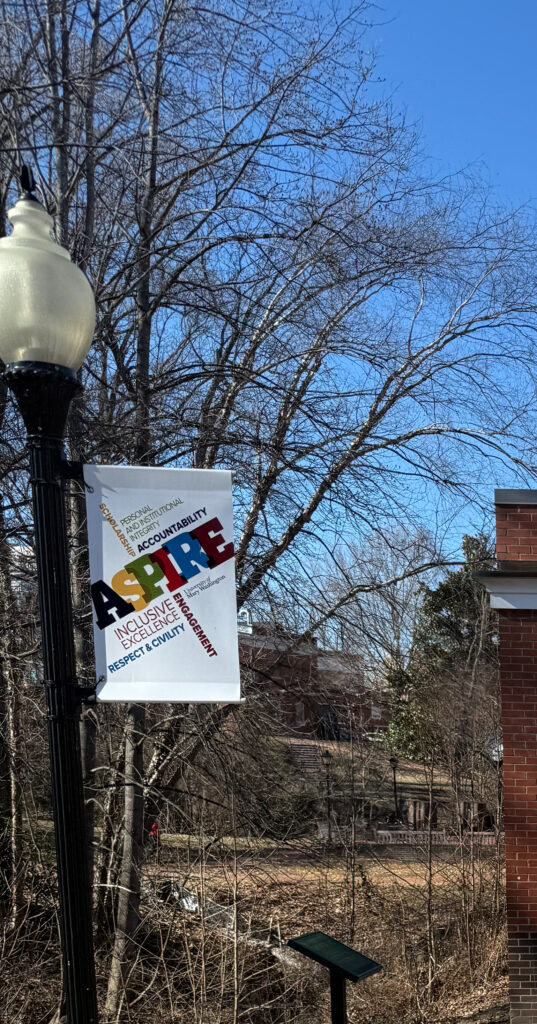
Unity is what brings all design elements together and highlights the relationship that all individual design elements play when they are brought together as one. This poster highlights unity by incorporating many elements into one cohesive manner. The poster uses a consistent color scheme where each letter in “ASPIRE” is color-coordinated, which helps tie all the elements together to create a cohesive visual experience.
The choice of fonts, as well as their alignment, helps create unity within this poster. The poster uses similar style fonts for different words, which helps maintain a consistent look. The alignment of the text also enhances the visual flow because it is smooth and organized, guiding the viewer’s eyes from one word to another.
The repetition of certain colors and fonts creates a sense of unity in the poster, reinforcing the theme and message of the poster itself. All of these design elements brought together effectively communicate its values while also being visually appealing and unified.